GSAP Card Animations
Card-based animation patterns for grids, galleries, and interactive layouts. 3D perspective flips, elastic stacking, staggered reveals, and smooth layout transitions that make card interfaces feel dynamic.
Unlock everything for £39
All 89 premium effects and templates, plus every future effect and template we release. That's £0.43 per item.
Buy individually now: up to £10 comes off the Vault later
Animating Card Interfaces with GSAP
Cards are the building blocks of modern web layouts. Product grids, portfolio galleries, feature lists, and dashboard widgets all use card patterns. Animating cards transforms these static grids into engaging, interactive surfaces that respond to user actions and scroll position.
GSAP brings cards to life with perspective-based 3D transforms, spring physics, and coordinated stagger animations. A 3D card flip reveals content on the back face. Elastic stacking lets users swipe through cards with physics-based inertia. Staggered reveals cascade cards into view as sections scroll into the viewport.
The GSAP Flip plugin is particularly powerful for card layouts. When filtering, sorting, or rearranging cards, Flip records positions before the change and animates to the new layout. Users see cards smoothly sliding to their new positions rather than elements popping in and out.
These card effects handle edge cases that simpler implementations miss: proper z-index management during 3D flips, container height adjustments during stacking, and consistent card sizing across different content lengths. They are production-ready patterns, not just demos.
How to build a 3D card flip with GSAP
Rotate a card on its Y axis with GSAP while CSS supplies the 3D context. The perspective and preserve-3d live in CSS; GSAP handles the timing and easing of the flip.
- 01
Set up the 3D context in CSS
Give the card perspective and transform-style: preserve-3d, and set backface-visibility: hidden on its two faces.
- 02
Tween rotationY
On click, animate rotationY between 0 and 180 with GSAP to flip between the front and back faces.
- 03
Ease the motion
Use a power3.inOut ease and a ~0.7s duration so the flip accelerates and settles rather than snapping.
import gsap from "gsap";

const card = document.querySelector(".card");
let flipped = false;

card.addEventListener("click", () => {
  flipped = !flipped;
  gsap.to(card, {
    rotationY: flipped ? 180 : 0,
    duration: 0.7,
    ease: "power3.inOut",
  });
});
Card Effects at a glance
| Effect | What it does | Built with | Difficulty |
|---|---|---|---|
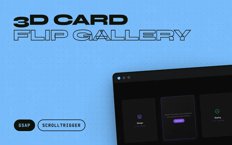
| 3D Card Flip Gallery | Tactile 3D cards with deep perspective, reactive edge-light, shadow inversion, hover/focus parity, and tap auto-close. | ScrollTrigger, 3d-transforms | intermediate |
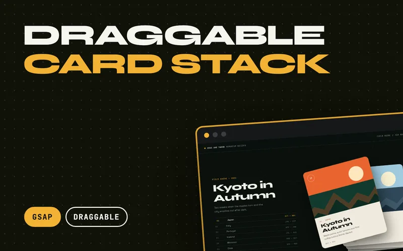
| Draggable Card Stack | Swipeable card deck powered by Draggable and InertiaPlugin. | Draggable, InertiaPlugin, draggable | intermediate |
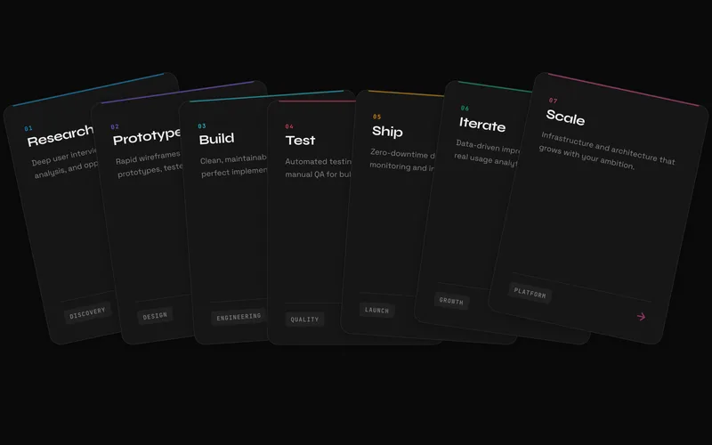
| Elastic Stack Cards | Stacked cards that spring open into a fan. | ScrollTrigger, hover-effect | intermediate |
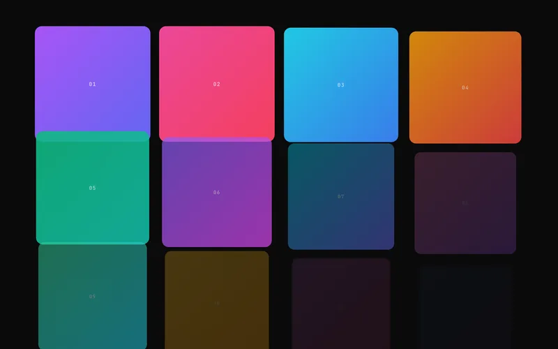
| Stagger Grid Reveal | Directional GSAP grid reveals that send tiles through corner, center, edge, axis, or random waves with cinematic rotation, scale, blur, and optional focus-aware tilt. | ScrollTrigger, scroll-reveal | intermediate |
| FLIP Layout Morph | Shared-element layout transitions powered by GSAP Flip, with a premium grid-to-detail archive showcase plus reusable lightbox and filter APIs. | Flip, flip-layout | intermediate |
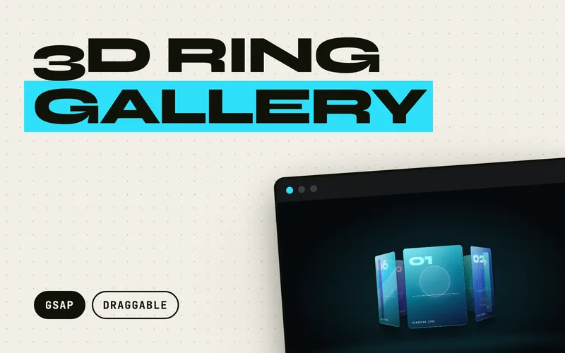
| 3D Ring Gallery | A draggable 3D ring carousel where cards stand on a cylinder in real perspective. | Draggable, InertiaPlugin, Flip, 3d-transforms | advanced |
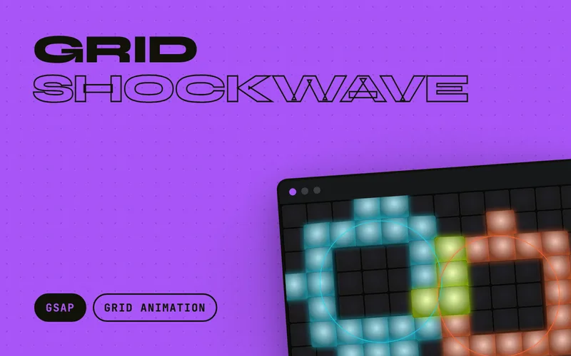
| Grid Shockwave | An interactive tile wall where every click detonates a radial shockwave: tiles pop, flash, and tip away from the epicentre in a distance-staggered ring wave, then settle with elastic overshoot. | grid-animation | intermediate |
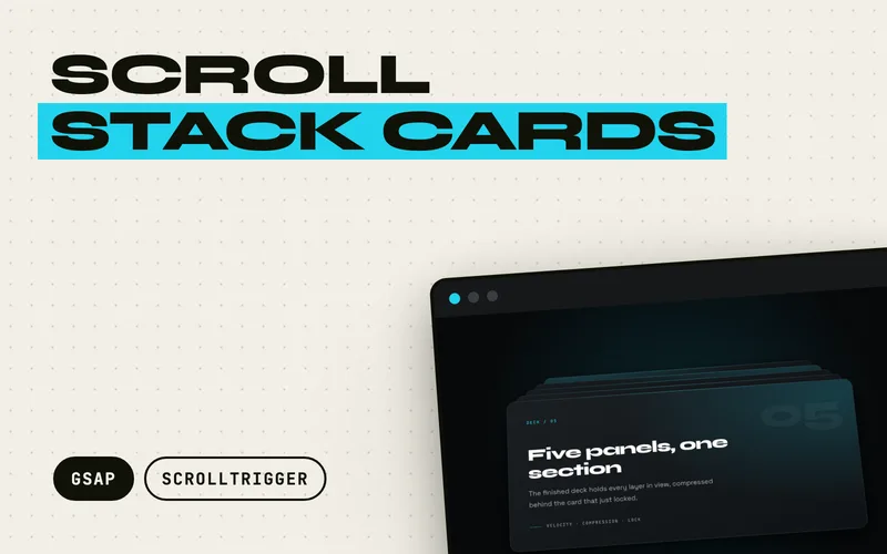
| Scroll Stack Cards | Full-width panels that stack over one another as you scroll, each one locking into place with an overshoot while the cards beneath compress into a visible deck. | ScrollTrigger, scroll-stack | advanced |
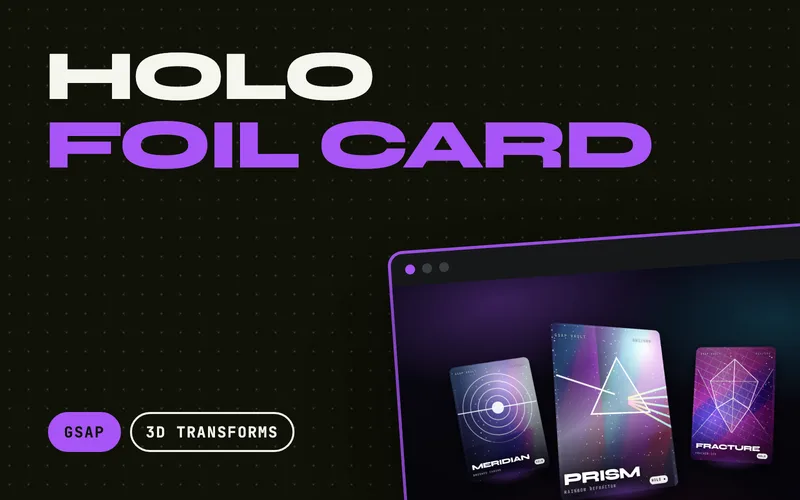
| Holo Foil Card | Trading-card holographic tilt: one pointer drives 3D rotation, an iridescent foil sheen, twinkling glitter, depth parallax and a specular bloom, then settles elastically. | 3d-transforms | advanced |
Related Guides
Animate on Scroll: 3 Approaches Compared
Learn to trigger animations on scroll. Compare CSS scroll animations, Intersection Observer, and GSAP ScrollTrigger to find the right approach.
Read guide
GSAP vs Anime.js vs Motion Compared
A practical comparison of GSAP, Anime.js, and Motion. Same animations built in each library, with bundle sizes, features, and a decision framework.
Read guideFrequently Asked Questions
How do 3D card flips work in CSS and GSAP?
CSS provides the 3D rendering context with perspective and transform-style: preserve-3d. GSAP animates the rotationY property to flip the card, handling the timing, easing, and backface-visibility toggling. This gives you smooth, controllable 3D transforms with GSAP's timeline sequencing.
Can I use card animations with React or Vue?
Yes. These effects use vanilla JavaScript and can be integrated into any framework. Wrap the initialization in useEffect (React) or onMounted (Vue), and call the cleanup function on unmount. The DOM structure is standard HTML that works in any component system.
How do staggered card reveals work?
Staggered reveals use ScrollTrigger to detect when cards enter the viewport, then animate them in sequence with a small delay between each card. The stagger property in GSAP controls the timing offset, creating a cascade effect that draws the eye across the grid.
Are card animations accessible?
Yes. These effects respect prefers-reduced-motion by disabling or simplifying animations for users who prefer less motion. Card content remains fully readable and navigable with keyboard and screen readers, regardless of animation state.