This page collects 28 GSAP animation examples, every one production-tested with a live demo you can open in a new tab. Seven of them are completely free, with the full copy-paste code inline below. The other 21 are premium effects with a one-paragraph rundown, a preview, and a link to the interactive demo.
Here are the concrete facts if you want the short version. There are 28 examples in total. Seven are free with complete HTML and JavaScript on this page. Every example runs on GSAP 3.14, and every one ships with prefers-reduced-motion accessibility handling and a clean teardown path so it works inside single-page apps and frameworks.
The free snippets use only the official GSAP CDN and, where relevant, the ScrollTrigger plugin. Nothing here needs a build step, a bundler, or a premium plugin. Paste a block into an HTML file, open it in a browser, and it runs.
Table of contents
- The 7 free examples with complete code
- Scroll and parallax examples
- Text and typography examples
- Cursor and hover examples
- Image and gallery examples
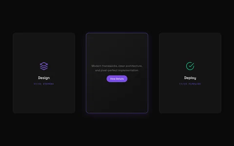
- Cards and layout examples
- Canvas and particle examples
The 7 free examples with complete code
Each of the seven examples below is self-contained. The code block includes the CDN script tags, the CSS, the markup, and the JavaScript. Every one checks prefers-reduced-motion before it animates, so users who opt out of motion still see the final content.
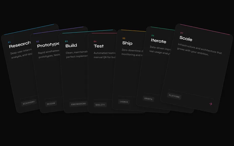
1. 3D Card Flip
A perspective-based flip that reveals back-face content on hover, with a tap fallback on touch devices. Reach for it on team profiles, pricing cards, product feature comparisons, or flashcard interfaces where a second layer of information belongs on the reverse of the card.
<script src="https://cdn.jsdelivr.net/npm/gsap@3.14.2/dist/gsap.min.js"></script>

<style>
  .flip-card { width: 240px; height: 300px; perspective: 1000px; cursor: pointer; }
  .flip-card-inner { position: relative; width: 100%; height: 100%; transform-style: preserve-3d; }
  .flip-card-front, .flip-card-back {
    position: absolute; inset: 0; backface-visibility: hidden;
    display: grid; place-items: center; border-radius: 16px; padding: 1rem; text-align: center;
  }
  .flip-card-front { background: #141414; color: #fff; }
  .flip-card-back { background: #8b5cf6; color: #fff; transform: rotateY(180deg); }
</style>

<div class="flip-card" tabindex="0" role="button" aria-label="Flip card">
  <div class="flip-card-inner">
    <div class="flip-card-front"><h3>Hover me</h3></div>
    <div class="flip-card-back"><p>Back content revealed</p></div>
  </div>
</div>

<script>
  const card = document.querySelector('.flip-card');
  const inner = card.querySelector('.flip-card-inner');
  const reduced = window.matchMedia('(prefers-reduced-motion: reduce)').matches;

  const flip = (deg) => reduced
    ? gsap.set(inner, { rotationY: deg })
    : gsap.to(inner, { rotationY: deg, duration: 0.8, ease: 'back.out(1.4)' });

  card.addEventListener('mouseenter', () => flip(180));
  card.addEventListener('mouseleave', () => flip(0));
  card.addEventListener('focus', () => flip(180));
  card.addEventListener('blur', () => flip(0));
</script>
See the 3D Card Flip demo for the click mode, auto-close groups, and staggered scroll entrances.
2. Scroll Progress Indicator
A fixed bar that fills as the reader moves down the page, driven by a single scrubbed ScrollTrigger. It is the standard reading-position cue for blog posts, documentation, and long-form articles. This snippet uses the linear bar; the full effect adds circle, rail, and numeric counter styles.
<script src="https://cdn.jsdelivr.net/npm/gsap@3.14.2/dist/gsap.min.js"></script>
<script src="https://cdn.jsdelivr.net/npm/gsap@3.14.2/dist/ScrollTrigger.min.js"></script>

<style>
  .progress-bar {
    position: fixed; top: 0; left: 0; height: 4px; width: 100%;
    transform: scaleX(0); transform-origin: left; background: #c8ff00; z-index: 100;
  }
</style>

<div class="progress-bar" aria-hidden="true"></div>

<script>
  gsap.registerPlugin(ScrollTrigger);

  if (window.matchMedia('(prefers-reduced-motion: reduce)').matches) {
    gsap.set('.progress-bar', { scaleX: 1 });
  } else {
    gsap.to('.progress-bar', {
      scaleX: 1,
      ease: 'none',
      scrollTrigger: {
        trigger: document.documentElement,
        start: 'top top',
        end: 'bottom bottom',
        scrub: 0.5
      }
    });
  }
</script>
See the Scroll Progress demo for the circular ring, vertical rail, and percentage counter variants.
3. CSS Scroll Reveal
The one example on this page with no JavaScript at all. It uses native CSS scroll-driven animations and the view() timeline to fade and slide elements in as they enter the viewport. Ideal for performance-critical marketing pages and static sites where you want entrance motion without shipping a library.
<style>
  .reveal-slide-up {
    animation: reveal-up auto linear both;
    animation-timeline: view();
    animation-range: entry 0% cover 40%;
  }
  @keyframes reveal-up {
    from { opacity: 0; transform: translateY(40px); }
    to { opacity: 1; transform: translateY(0); }
  }
  @media (prefers-reduced-motion: reduce) {
    .reveal-slide-up { animation: none; opacity: 1; transform: none; }
  }
  @supports not (animation-timeline: view()) {
    .reveal-slide-up { animation: none; opacity: 1; transform: none; }
  }
</style>

<div class="reveal-slide-up">This slides up as it enters the viewport</div>
CSS scroll-driven animations work in Chrome, Edge, and Safari 18 and up; the @supports fallback keeps content visible everywhere else. Check caniuse.com for current status. See the CSS Scroll Reveal demo for the fade, scale, and directional slide classes.
4. Typewriter Text
Text that types itself out character by character with a blinking cursor when it scrolls into view. It draws the eye on hero headlines and terminal-themed landing pages. The typing runs on a single GSAP tween with snap, so there is no setInterval to manage or clear.
<script src="https://cdn.jsdelivr.net/npm/gsap@3.14.2/dist/gsap.min.js"></script>
<script src="https://cdn.jsdelivr.net/npm/gsap@3.14.2/dist/ScrollTrigger.min.js"></script>

<style>
  .typewriter__cursor {
    display: inline-block; width: 2px; height: 1em; background: currentColor;
    margin-left: 2px; vertical-align: text-bottom; animation: blink 1s steps(1) infinite;
  }
  @keyframes blink { 50% { opacity: 0; } }
</style>

<h2 data-typewriter>Build interfaces that feel alive.</h2>

<script>
  gsap.registerPlugin(ScrollTrigger);

  document.querySelectorAll('[data-typewriter]').forEach((el) => {
    const full = el.textContent.trim();
    el.setAttribute('aria-label', full);

    if (window.matchMedia('(prefers-reduced-motion: reduce)').matches) return;

    const textSpan = document.createElement('span');
    textSpan.setAttribute('aria-hidden', 'true');
    const cursor = document.createElement('span');
    cursor.className = 'typewriter__cursor';
    cursor.setAttribute('aria-hidden', 'true');
    el.textContent = '';
    el.append(textSpan, cursor);

    const state = { chars: 0 };
    const tween = gsap.to(state, {
      chars: full.length,
      duration: full.length * 0.045,
      ease: 'none',
      snap: { chars: 1 },
      paused: true,
      onUpdate() { textSpan.textContent = full.slice(0, state.chars); }
    });

    ScrollTrigger.create({ trigger: el, start: 'top 85%', once: true, onEnter: () => tween.play() });
  });
</script>
See the Typewriter Text demo for looping phrases, custom speed, and delay controls.
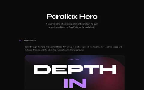
5. Parallax Hero
A layered hero where background, headline, and foreground move at different speeds to create depth, all from one scrubbed ScrollTrigger per scene. Each layer declares its own speed with a data attribute: values below 1 lag behind the scroll, values above 1 race ahead. No image assets required.
<script src="https://cdn.jsdelivr.net/npm/gsap@3.14.2/dist/gsap.min.js"></script>
<script src="https://cdn.jsdelivr.net/npm/gsap@3.14.2/dist/ScrollTrigger.min.js"></script>

<style>
  .parallax-hero { position: relative; height: 100vh; overflow: clip; display: grid; place-items: center; }
  .parallax-layer { position: absolute; inset: -12% 0; display: grid; place-items: center; will-change: transform; }
  .hero-blob {
    width: 60vmin; height: 60vmin; border-radius: 50%;
    background: radial-gradient(circle, #8b5cf6, transparent 70%); filter: blur(40px);
  }
</style>

<section class="parallax-hero" data-parallax>
  <div class="parallax-layer" data-parallax-speed="0.3" aria-hidden="true">
    <div class="hero-blob"></div>
  </div>
  <div class="parallax-layer" data-parallax-speed="0.8">
    <h1>Depth without images</h1>
  </div>
</section>

<script>
  gsap.registerPlugin(ScrollTrigger);

  gsap.matchMedia().add('(prefers-reduced-motion: no-preference)', () => {
    document.querySelectorAll('[data-parallax]').forEach((scene) => {
      const layers = scene.querySelectorAll('[data-parallax-speed]');
      const tl = gsap.timeline({
        scrollTrigger: { trigger: scene, start: 'clamp(top bottom)', end: 'clamp(bottom top)', scrub: true }
      });
      layers.forEach((layer) => {
        const shift = (1 - parseFloat(layer.dataset.parallaxSpeed)) * 50;
        tl.fromTo(layer, { yPercent: -shift }, { yPercent: shift, ease: 'none' }, 0);
      });
    });
  });
</script>
See the Parallax Hero demo for the fade-on-exit option and multi-scene layouts.
6. Image Clip Reveal
Images that wipe into view with an animated clip-path while the inner picture settles from an oversized scale down to its natural size, the classic Ken Burns settle. The initial hidden state lives in CSS, so images never flash before the script runs. Perfect for editorial photo grids and portfolio case studies.
<script src="https://cdn.jsdelivr.net/npm/gsap@3.14.2/dist/gsap.min.js"></script>
<script src="https://cdn.jsdelivr.net/npm/gsap@3.14.2/dist/ScrollTrigger.min.js"></script>

<style>
  [data-clip-reveal] { overflow: hidden; clip-path: inset(0 0 100% 0); }
  [data-clip-reveal] img { display: block; width: 100%; height: auto; transform: scale(1.25); }
  @media (prefers-reduced-motion: reduce) {
    [data-clip-reveal] { clip-path: none !important; }
    [data-clip-reveal] img { transform: none !important; }
  }
</style>

<div data-clip-reveal>
  <img src="photo.jpg" alt="Description of the photo">
</div>

<script>
  gsap.registerPlugin(ScrollTrigger);

  gsap.matchMedia().add('(prefers-reduced-motion: no-preference)', () => {
    document.querySelectorAll('[data-clip-reveal]').forEach((wrap) => {
      const img = wrap.querySelector('img');
      gsap.timeline({ scrollTrigger: { trigger: wrap, start: 'top 85%', once: true } })
        .to(wrap, { clipPath: 'inset(0%)', duration: 1.1, ease: 'expo.out' }, 0)
        .to(img, { scale: 1, duration: 1.1, ease: 'expo.out' }, 0);
    });
  });
</script>
See the Image Clip Reveal demo for the four wipe directions and staggered reveal groups.
7. Hover Underline
An animated link underline that grows from the left on hover and exits through the right, so it never plays in reverse. It runs on GSAP core alone, no plugins, and the script injects the underline element for you, so your markup stays clean. Focus and blur mirror the hover, so keyboard users get the same animation.
<script src="https://cdn.jsdelivr.net/npm/gsap@3.14.2/dist/gsap.min.js"></script>

<style>
  [data-underline] { position: relative; text-decoration: none; color: inherit; }
  .hu-line {
    position: absolute; left: 0; bottom: -2px; width: 100%; height: 2px;
    background: currentColor; transform: scaleX(0); transform-origin: left;
  }
  @media (prefers-reduced-motion: reduce) {
    [data-underline] { text-decoration: underline; }
  }
</style>

<a href="/work" data-underline>Work</a>

<script>
  if (!window.matchMedia('(prefers-reduced-motion: reduce)').matches) {
    document.querySelectorAll('[data-underline]').forEach((link) => {
      const line = document.createElement('span');
      line.className = 'hu-line';
      line.setAttribute('aria-hidden', 'true');
      link.appendChild(line);

      const enter = () => {
        gsap.set(line, { transformOrigin: 'left' });
        gsap.to(line, { scaleX: 1, duration: 0.4, ease: 'power2.out' });
      };
      const leave = () => {
        gsap.set(line, { transformOrigin: 'right' });
        gsap.to(line, { scaleX: 0, duration: 0.4, ease: 'power2.in' });
      };

      link.addEventListener('mouseenter', enter);
      link.addEventListener('mouseleave', leave);
      link.addEventListener('focus', enter);
      link.addEventListener('blur', leave);
    });
  }
</script>
See the Hover Underline demo for the marker-style fill and hand-drawn SVG wave variants.
Scroll and parallax examples
Scroll-driven animation is where GSAP earns its keep. ScrollTrigger handles pinning, scrubbing, and viewport detection that would take hundreds of lines of Intersection Observer code to approximate. These five premium effects cover the most requested patterns.
8. Scroll Hijack Sections
A scroll-driven, word-by-word text reveal with pinned sections that lock in place while the content animates. Three reveal directions, horizontal slide, vertical rise, and scale with fade, create different reading experiences, and multiple sections chain together with a shared progress indicator. Built for brand storytelling, product walkthroughs, and immersive long-form editorial. View the Scroll Hijack Sections effect.
9. Scroll Image Sequence

An Apple-style, scroll-driven image sequence that draws pre-rendered frames to a canvas as the user scrolls. ScrollTrigger pins the viewport and maps scroll progress to frame index, giving you the same frame-by-frame playback that powers premium product reveals. It preloads frames with a progress indicator and renders at HiDPI for crisp results on retina screens. View the Scroll Image Sequence effect.
10. Horizontal Scroll Section
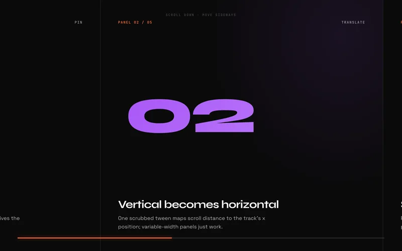
A pinned section where vertical scrolling translates a horizontal track of panels sideways, then releases cleanly when the track ends. Panels can be any mix of widths because the travel distance is measured from the track’s real scrollWidth, so the layout stays accurate through resizes and font loads. Optional snap-to-panel, per-element parallax, and a scrub-linked progress bar are all driven by data attributes. View the Horizontal Scroll Section effect.
11. SVG Line Draw on Scroll
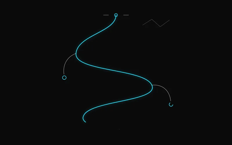
SVG paths that draw themselves as you scroll, using the classic stroke-dasharray and stroke-dashoffset technique. It needs no premium plugin: core GSAP plus ScrollTrigger handle everything, and each shape is auto-measured with getTotalLength() so it works on paths, lines, circles, rects, and polylines alike. Choose scrubbed drawing that follows the scrollbar in both directions, or a play-once reveal on viewport entry. View the SVG Line Draw effect.
12. Count-Up Stats
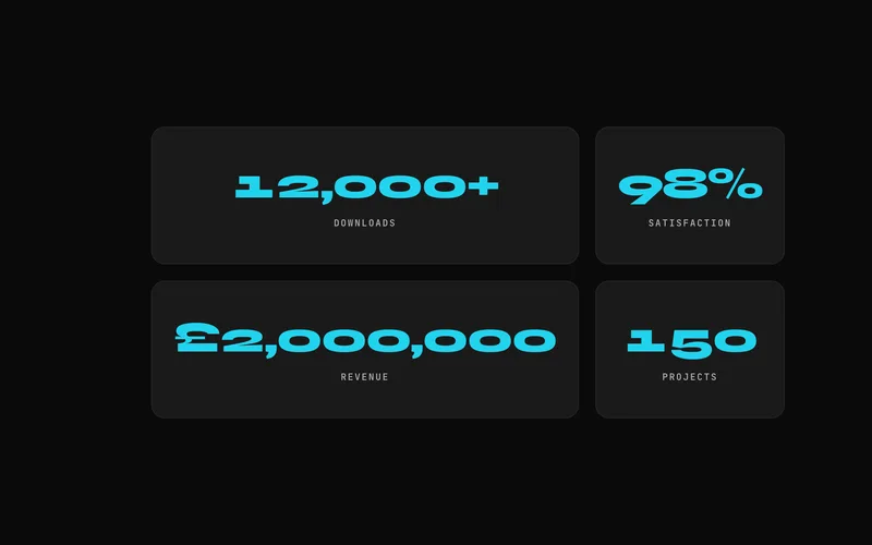
Scroll-triggered number counters that animate from zero to their target the moment they enter view, with locale-aware thousands separators, currency prefixes, percentage suffixes, and decimal precision through simple data attributes. Each counter fires exactly once so it never replays mid-read, and stat blocks fade and rise in a staggered sequence as their numbers climb. A beginner-friendly effect that gives metrics sections instant momentum. View the Count-Up Stats effect.
Text and typography examples
Text is the most animated element on the web. Beyond the free typewriter effect above, these four premium effects cover split reveals, cipher decodes, glitch distortion, and cursor-reactive characters.
13. Split Text Stagger Reveal

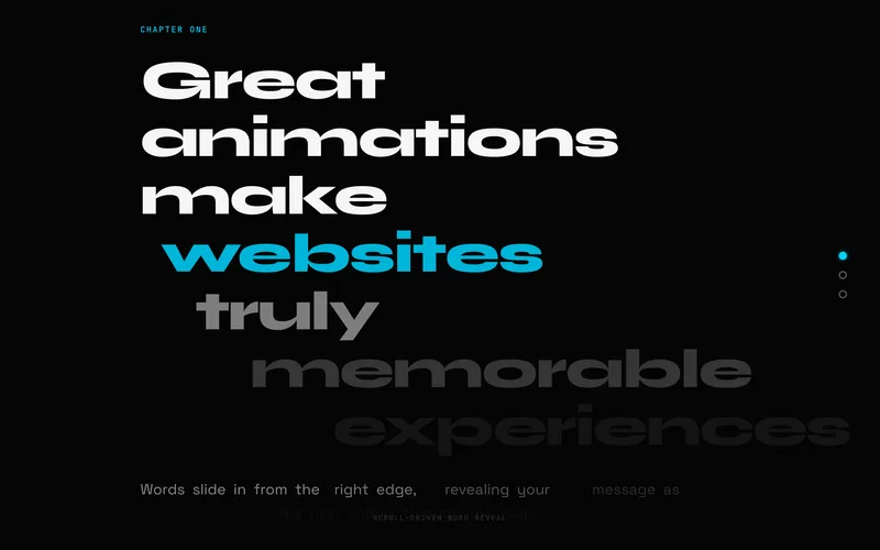
A comprehensive text-splitting system that breaks content into characters, words, or lines, then applies staggered reveal animations as elements scroll into view. Seven distinct styles, fade, scale, blur, rotate, clip mask, slide, and elastic, each carry their own timing curve, and the whole thing is built on GSAP SplitText for reliable splitting across fonts and languages. The workhorse choice for polished hero and section headings. View the Split Text Reveal effect.
14. Text Scramble Decode
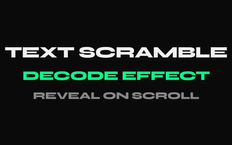
A cipher-style animation that scrambles characters through random glyphs before revealing the final content, inspired by sci-fi terminals and hacker interfaces. It supports four trigger modes, scroll, hover, click, and auto-play, and five decode directions from left-to-right to center-out and random. Custom character sets let you match the scramble to your design language, techy, cyberpunk, or something in between. View the Text Scramble Decode effect.
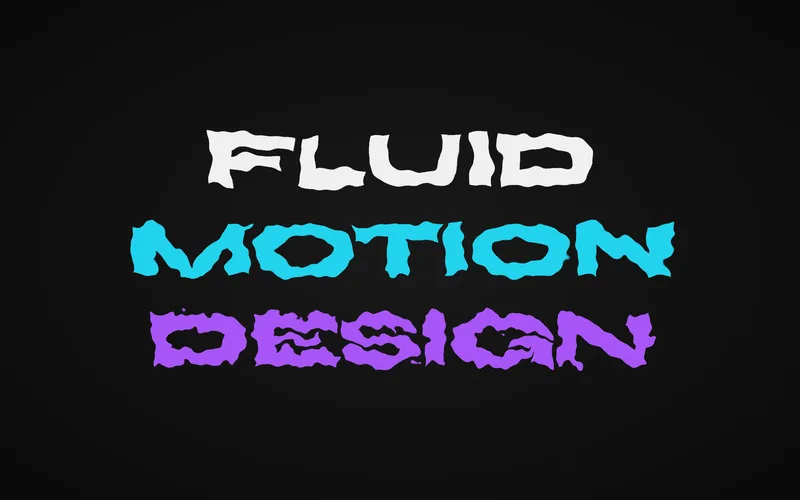
15. Glitch Text Effect
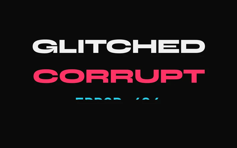
A digital glitch effect that distorts text with displacement shifts, RGB chromatic aberration, and CRT-style scan lines. It supports scroll-triggered activation and hover bursts across three intensity presets, and exposes CSS custom properties for quick colour and timing tweaks. Best used sparingly on a single headline for cyberpunk themes, gaming pages, and error screens with personality. View the Glitch Text effect.
16. Text Hover Distortion
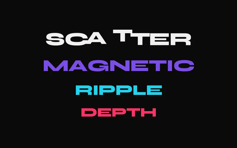
An interactive effect where individual characters react to cursor proximity with physics-based displacement: push, pull, wave, or rotation, based on distance from the pointer. It tracks position at 60fps with gsap.quickTo and returns characters to rest with elastic easing. This is a desktop-focused, short-text effect for interactive hero headings and creative navigation, with a graceful mobile fallback. View the Text Hover Distortion effect.
Cursor and hover examples
Custom cursors and hover interactions are the signature of award-winning agency sites. These four effects run on GSAP core, using quickTo and element pooling to stay at 60fps even during fast mouse movement.
17. Magnetic Cursor Effect
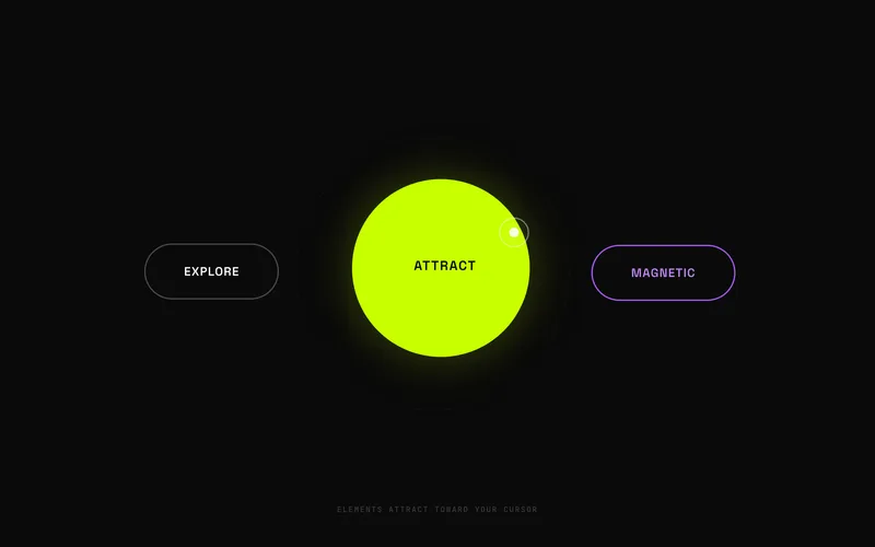
An elastic magnetic attraction that makes elements pull toward the cursor when it enters their field, then snap back naturally on exit. Strength, radius, and easing are configurable per element through data attributes, and an optional inner-content offset creates layered depth. It works on any element, buttons, links, images, or cards, and disables itself gracefully on touch devices. View the Magnetic Cursor effect.
18. Cursor Trail Effect
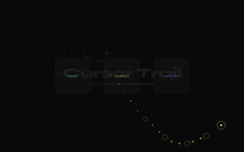
A premium custom cursor with a precise dot and a trailing ring that follow the mouse at independent easing speeds. The ring expands over interactive elements, shrinks on click, and can reveal content through a spotlight mode. Built with gsap.quickTo for consistent 60fps tracking and mix-blend-mode support for automatic colour inversion over any background. View the Cursor Trail effect.
19. Cursor Confetti Trail
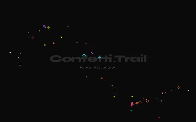
A playful cursor trail that spawns colourful geometric shapes at the pointer as you move, each scaling in with an elastic bounce, rotating randomly, and falling away with a gravity-like ease. DOM elements are recycled in a round-robin pool using gsap.utils.wrap(), so there is zero garbage-collection overhead no matter how long you move the mouse. Inline SVG shapes mean no external dependencies. View the Cursor Confetti Trail effect.
20. Hover Image Trail
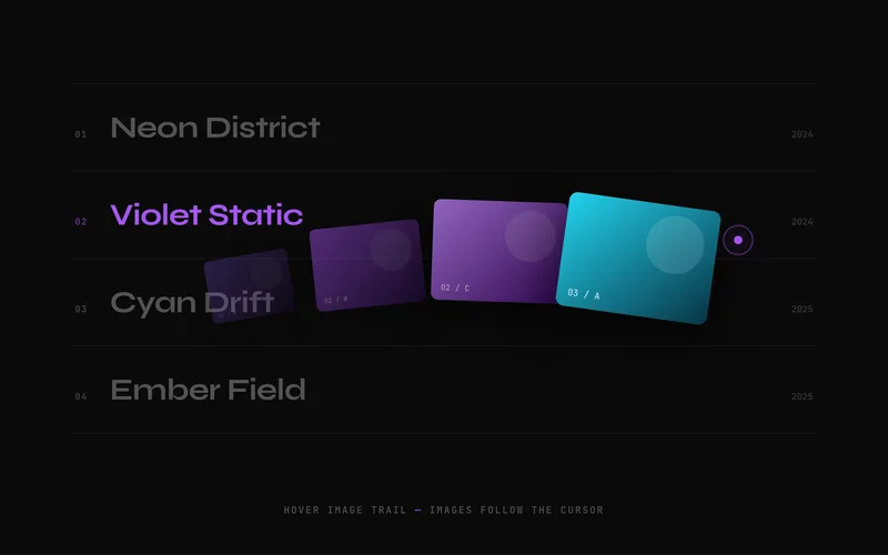
The signature award-site interaction: as the cursor sweeps across a section, preview images spawn at the pointer, drift in the direction of travel with a velocity-based tilt, then scale and fade away. Each row defines its own image set, and a fixed element pool is reused round-robin so the DOM never grows. Built on GSAP core only, with a keyboard-focus fallback that reveals each row’s image statically. View the Hover Image Trail effect.
Image and gallery examples
Galleries and image strips are where motion meets content. These three effects range from a mouse-controlled marquee to an infinite draggable grid and a liquid distortion filter.
21. Infinite Marquee with Mouse Control

A continuous infinite marquee that responds to mouse movement in real time. Unlike a basic CSS marquee, this uses gsap.quickTo to achieve smooth 60fps speed changes as the cursor moves: move left to rewind, right to fast-forward, or hover the centre to pause. The loop has no visible seam, the ticker pauses when off-screen to save resources, and multiple rows can run at independent speeds. View the Infinite Marquee effect.
22. Infinite Draggable Gallery
A physics-based gallery that loops infinitely in any direction, with a fisheye effect that scales cards up as they approach the centre. Flicking a card sends the whole grid gliding to a smooth, momentum-based stop. GSAP Observer unifies touch and mouse input, and wrap-based positioning eliminates layout recalculations, keeping it fluid on both desktop and mobile. View the Infinite Draggable Gallery effect.
23. Liquid Morph Gallery
A viscous liquid distortion that makes images, cards, and text appear to melt, ripple, and reform on hover or scroll. It uses SVG displacement filters for broad browser compatibility, with an optional PixiJS WebGL shader path for enhanced text distortion. Turbulence frequency, scale, and speed are all configurable, and the pipeline avoids layout thrash for smooth playback. This is an advanced effect for premium creative studio sites. View the Liquid Morph effect.
Cards and layout examples
When elements need to move between positions, layouts, or states, GSAP’s Flip plugin and elastic easing do the heavy lifting. These three effects handle stacked cards, shared-element morphs, and grid entrances.
24. Elastic Stack Cards
A card stack where overlapping cards fan out with satisfying elastic spring physics, driven by scroll position or hover. Cards begin tightly stacked with subtle depth offsets, then spread into an even arrangement with per-card staggered timing. Click a card to bring it to the front with an elastic lift, and reduced-motion users get a clean grid fallback. View the Elastic Stack Cards effect.
25. FLIP Layout Morph
A layout animation system powered by GSAP’s Flip plugin, which captures element state before a DOM change and animates smoothly from the old position to the new. It ships three demos: a grid-to-detail shared-element morph, a gallery lightbox morph with backdrop blur, and a filterable grid that rearranges with staggered enter and exit animations. The go-to technique for any layout where elements need to travel between positions. View the FLIP Layout Morph effect.
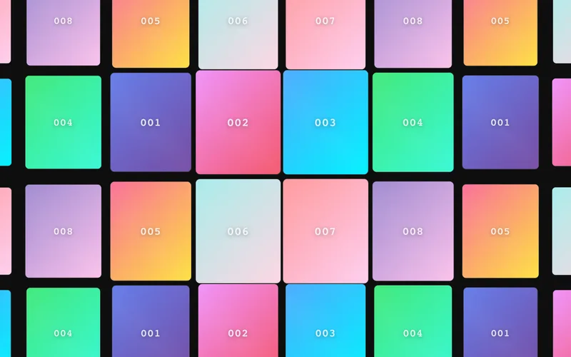
26. Stagger Grid Reveal
A grid entrance system with directional stagger and scroll-triggered reveals. Items enter from eight directions, including diagonal and centre-outward, across seven animation styles, with wave and spiral patterns for organic motion. ScrollTrigger batch processing keeps performance high on large grids, and an optional hover tilt adds 3D perspective on pointer devices. Ideal for portfolio grids, product listings, and feature cards. View the Stagger Grid Reveal effect.
Canvas and particle examples
For ambient backgrounds and generative motion, canvas rendering paired with GSAP’s ticker delivers effects that DOM elements cannot. These two advanced effects run entirely on GSAP core, no WebGL required.
27. Canvas Particle Flow
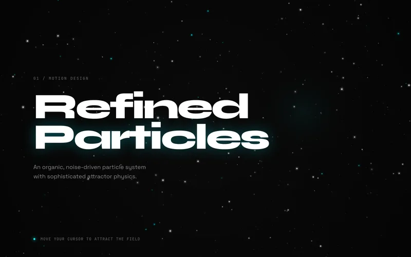
A Canvas 2D particle system that trades mathematical spirals for organic, flow-field motion. Particles behave like floating dust or embers, swaying with simulated noise before being drawn smoothly toward a high-inertia attractor at the mouse. Soft radial gradients and alpha blending create a misty, deep-space aesthetic, and it holds 60fps even at high particle counts. A refined background for high-end agency and luxury brand pages. View the Canvas Particle Flow effect.
28. Canvas Shape Vortex
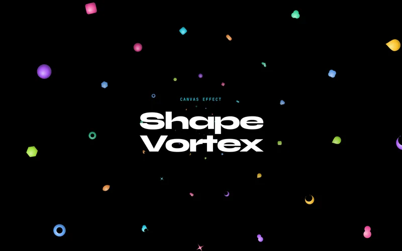
A canvas particle system that renders 14 distinct 3D-looking shapes, spheres, hearts, flowers, sparkles, and more, spiralling outward from a central vortex. Each shape uses offset radial gradients for a glossy dimensional look and scales with distance for tunnel perspective, while the vortex centre gently follows the cursor. Five colour palettes plus a full rainbow, all pre-rendered as sprites for smooth 60fps playback, with no WebGL required. View the Canvas Shape Vortex effect.
How to choose the right example
With 28 options, start by narrowing on two axes.
By difficulty. If you are new to GSAP, the beginner effects are the fastest wins: the free Scroll Progress, Typewriter Text, Parallax Hero, Image Clip Reveal, and Hover Underline examples above, plus Count-Up Stats and CSS Scroll Reveal. Intermediate effects like the 3D Card Flip, Split Text Reveal, and Horizontal Scroll Section add configuration and interaction. The advanced tier, Liquid Morph, Text Hover Distortion, and the two canvas systems, involves shaders, physics, or per-frame rendering.
By plugin. Most scroll effects need only core GSAP plus ScrollTrigger, both free on the official GSAP CDN. A few reach for specialised plugins: Split Text Reveal uses SplitText, FLIP Layout Morph uses Flip, and the Infinite Draggable Gallery uses Observer. All of these are now free to use. The cursor, canvas, and hover effects run on GSAP core alone with no plugins at all.
Whichever you pick, the accessibility baseline is the same across every example: check prefers-reduced-motion, keep animations off the main thread by sticking to transform and opacity, and provide a clean teardown so the effect works inside single-page apps.
Ready to build? The seven free examples above are yours to copy right now. For the full production versions of all 28, with every trigger mode, configuration option, and edge case handled, browse the complete effects library or get everything at once with the All-Access Bundle for £29. New to GSAP entirely? Start with the getting started guide for setup, registration, and your first tween.