CSS animations have come a long way. With @keyframes, transitions, and now scroll-driven animations, you can build impressive effects without any JavaScript. So why would you reach for GSAP?
The answer isn’t “always use GSAP” or “CSS is enough.” It depends on what you’re building. This guide breaks down when each approach shines.
When CSS Animations Are the Right Choice
CSS handles many common animation needs elegantly:
Simple Hover States and Transitions
.button {
  transition: transform 0.2s ease, background 0.2s ease;
}

.button:hover {
  transform: translateY(-2px);
  background: #c8ff00;
}
For basic state changes—hovers, focus states, menu toggles—CSS transitions are simpler and perfectly performant. No library needed.
Loading Spinners and Loops
@keyframes spin {
  to { transform: rotate(360deg); }
}

.spinner {
  animation: spin 1s linear infinite;
}
Infinite loops that don’t need JavaScript control are ideal CSS territory.
Entrance Animations on Scroll (Modern Browsers)
CSS scroll-driven animations (2024+) now handle basic scroll-triggered reveals:
@keyframes fade-in {
  from { opacity: 0; transform: translateY(20px); }
  to { opacity: 1; transform: translateY(0); }
}

.card {
  animation: fade-in linear both;
  animation-timeline: view();
  animation-range: entry 0% entry 100%;
}
For simple fade-ins on scroll, this works without JavaScript. Browser support is improving but not universal yet.
When GSAP Becomes Essential
GSAP isn’t about replacing CSS—it’s about doing what CSS can’t.
Complex Sequencing
Chaining animations in CSS requires calculating delays manually:
/* CSS approach - manual delay math */
.item:nth-child(1) { animation-delay: 0s; }
.item:nth-child(2) { animation-delay: 0.1s; }
.item:nth-child(3) { animation-delay: 0.2s; }
/* ... for every element */
GSAP handles this naturally:
gsap.from(".item", {
y: 30,
opacity: 0,
stagger: 0.1,
ease: "power2.out"
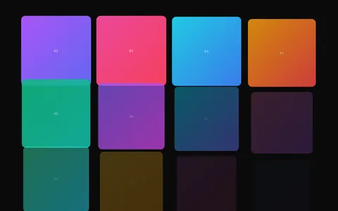
});When you have 20 items, or the count is dynamic, GSAP’s approach scales effortlessly. The Stagger Grid Reveal effect demonstrates this pattern with a full grid of elements animating in sequence.
Timeline Control
Real applications need to pause, reverse, speed up, or seek animations:
const tl = gsap.timeline({ paused: true });

tl.to(".modal", { opacity: 1, duration: 0.3 })
  .from(".modal-content", { y: 20, duration: 0.3 }, "-=0.1")
  .from(".modal-buttons", { opacity: 0, stagger: 0.1 });

// Later: control it
openButton.addEventListener("click", () => tl.play());
closeButton.addEventListener("click", () => tl.reverse());
CSS has no equivalent. You’d need to toggle classes and hope timing aligns.
Scroll-Linked Animations (Scrubbing)
ScrollTrigger connects animation progress directly to scroll position:
gsap.to(".progress-bar", {
  width: "100%",
  ease: "none",
  scrollTrigger: {
    trigger: ".content",
    start: "top top",
    end: "bottom bottom",
    scrub: true  // Animation progress = scroll progress
  }
});
The animation doesn’t just trigger on scroll—it follows the scroll. CSS scroll-driven animations can do basic versions of this, but GSAP offers pinning, callbacks, snapping, and far more control. For a deep dive into all three approaches to scroll animation, see Animate on Scroll: 3 Approaches Compared.
For an example of scroll-linked animation at its most visual, the Scroll Image Sequence effect renders frame-by-frame sequences tied to scroll position.
Animating Non-CSS Properties
GSAP animates anything numeric:
// Animate a counter
gsap.to(counterObj, {
value: 1000,
duration: 2,
onUpdate: () => {
element.textContent = Math.round(counterObj.value);
}
});
// Animate SVG path morphing (see the liquid morph effect)
gsap.to("#path", { morphSVG: "#targetPath" });
// Animate Three.js objects
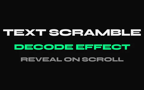
gsap.to(mesh.position, { x: 5, y: 2, duration: 1 });CSS can only animate CSS properties. GSAP animates any JavaScript value—SVG morphing, canvas objects, even text scramble effects that cycle through random characters.
Responsive Animation Differences
Different animations for different screen sizes:
let mm = gsap.matchMedia();

mm.add("(min-width: 768px)", () => {
  // Desktop: horizontal scroll gallery
  gsap.to(".gallery", {
    x: () => -galleryWidth,
    scrollTrigger: { scrub: true }
  });
});

mm.add("(max-width: 767px)", () => {
  // Mobile: simple fade-in cards
  gsap.from(".card", {
    opacity: 0,
    y: 30,
    stagger: 0.1,
    scrollTrigger: { trigger: ".gallery" }
  });
});
GSAP’s matchMedia properly creates and destroys animations at breakpoints. CSS media queries can change values, but managing complex scroll animations responsively is painful without JavaScript.
Performance: The Real Story
A common misconception: “CSS animations are always faster than JavaScript.”
The truth is more nuanced:
What actually matters for performance:
- Animating
transformandopacity(both CSS and GSAP do this) - Avoiding layout thrashing (reflows)
- Minimizing paint areas
- Running on the compositor thread when possible
GSAP animates the same optimized properties. Both can achieve 60fps. The difference isn’t usually measurable in practice.
Where CSS has an edge:
- Very simple animations with no JS bundle cost
- Animations that run when JavaScript is blocked
Where GSAP has an edge:
- Complex sequences (less code, easier maintenance)
- Coordinating many elements (better batching)
- ScrollTrigger’s refresh/resize handling
For most real-world animations, the “performance” choice should be about maintainability, not milliseconds.
The Practical Decision Framework
Use CSS when:
- Hover/focus state transitions
- Simple infinite loops (spinners, pulses)
- Basic entrance animations
- You need zero JavaScript for that feature
- Browser support for CSS scroll-driven animations meets your needs
Use GSAP when:
- Sequencing multiple elements
- You need play/pause/reverse control
- Scroll-linked animations with scrubbing
- Animating non-CSS values (counters, SVG morphs, canvas)
- Complex responsive behavior
- You need callbacks during animation
- Cross-browser consistency matters
The hybrid approach: Many projects use both. CSS handles simple interactions; GSAP handles the showcase animations. There’s no rule that says you must pick one.
Getting Started with GSAP
If you’ve been CSS-only and want to try GSAP:
<script src="https://cdn.jsdelivr.net/npm/gsap@3.14.2/dist/gsap.min.js"></script>
<script src="https://cdn.jsdelivr.net/npm/gsap@3.14.2/dist/ScrollTrigger.min.js"></script>gsap.registerPlugin(ScrollTrigger);
// Your first scroll animation
gsap.from(".hero-text", {
y: 50,
opacity: 0,
duration: 1,
scrollTrigger: {
trigger: ".hero",
start: "top 80%"
}
});That’s genuinely all it takes to get started. The GSAP documentation is excellent for going deeper.
Conclusion
CSS animations aren’t a “lesser” option, and GSAP isn’t overkill for everything. They solve different problems.
Use CSS for simple, stateless transitions. Use GSAP when you need sequencing, control, or scroll-linked behavior. Use both when it makes sense.
The best animation code is the code that’s maintainable, performs well, and achieves the effect you need. Sometimes that’s three lines of CSS. Sometimes that’s a GSAP timeline. Know when to reach for each.
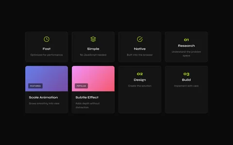
Looking for production-ready GSAP effects? Browse the GSAP Vault effects library for scroll animations, text effects, and interactive components you can drop into any project.
Related Articles
- Animate on Scroll: 3 Approaches Compared — A hands-on comparison of CSS scroll animations, Intersection Observer, and GSAP ScrollTrigger.
- Adding a Text Scramble Effect to WordPress — A practical example of adding a GSAP effect that CSS simply can’t replicate.
- Using AI to Customize GSAP Effects — How to use AI assistants to adapt and customize GSAP animation code faster.
- Webflow Custom Animations with GSAP — Apply these CSS vs GSAP principles specifically to Webflow projects.