You update the blog posts, swap out images, tweak the headlines. But the animations on your site? Those feel like a black box. They either work or they don’t, and when someone asks “can we make this more dynamic?” you’re not sure what’s realistic.
This guide gives you the vocabulary to understand what’s possible, when animation helps (and when it hurts), and how to communicate with developers without talking past each other.
The animation vocabulary
Before you can discuss animations, you need names for them. Here are the categories you’ll encounter:
Entrance animations
Elements that appear as you scroll down the page. Text fades in, images slide up, cards scale into view. These are the most common type—almost every modern website uses them.
What to call them: “scroll reveal,” “fade in on scroll,” “entrance animation”
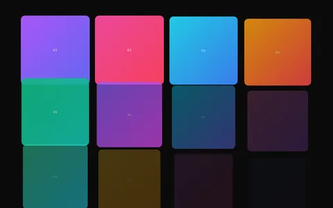
To see what entrance animations look like in practice, the Stagger Grid Reveal effect demonstrates cards and elements appearing in sequence as you scroll.
Hover effects
Reactions to mouse movement. Buttons that lift or change color. Images that zoom. Cards that tilt. These give feedback that something is clickable.
What to call them: “hover state,” “hover effect,” “rollover”
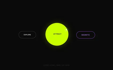
The Magnetic Cursor effect is a good example of hover-driven motion, where buttons subtly attract toward your cursor as you move near them.
Scroll-linked animations
The animation progress is tied to how far you’ve scrolled. Scroll down, the animation moves forward. Scroll back up, it reverses. Common for storytelling pages and product reveals.
What to call them: “scroll-linked,” “scroll-scrubbed,” “parallax” (though parallax technically means something more specific)
The Scroll Image Sequence effect is a good example, rendering a frame-by-frame animation tied directly to how far you’ve scrolled.
Loading and transitions
What happens when the page first loads or when you navigate between pages. Logos that animate in, content that fades between pages, loading spinners.
What to call them: “page load animation,” “page transition,” “loading state”
Micro-interactions
Small, subtle animations that make interfaces feel responsive. A button that bounces when clicked. A form field that shakes when invalid. A checkmark that draws itself.
What to call them: “micro-interaction,” “feedback animation,” “UI animation”
What you can usually control
Many animations are built with configuration in mind. Without touching code, you might be able to adjust:
Timing — Make animations faster, slower, or add a delay before they start. Often controlled through a settings panel or CSS variables.
Direction — Change whether elements fade up, down, left, or right. Slide in from different edges.
Which elements animate — Enable or disable animations on specific sections. Often controlled by adding or removing a CSS class.
Mobile behavior — Some sites let you disable animations on mobile devices for performance or simplicity.
Ask your developer: “What animation settings can I change without code?” You might have more control than you realize.
What needs a developer
Some changes require code modifications:
Adding new animation types — If your site has fade-in reveals and you want a text scramble effect, that’s new code.
Changing the animation style entirely — Switching from “fade up” to “scale and rotate” isn’t a setting change—it’s a rewrite.
Physics-based effects — Magnetic buttons, elastic motion, momentum scrolling. These require JavaScript libraries and math.
Performance fixes — If animations are janky or slow, the fix is usually in the code, not the settings.
Complex sequencing — “First this appears, then that, but only after the user has scrolled here.” Logic like this lives in code.
When requesting changes, it helps to know whether you’re asking for a tweak or a rebuild.
How to request animations effectively
Developers aren’t mind readers. “Make it pop” or “add some wow factor” doesn’t give them enough to work with. Here’s how to communicate clearly:
Show, don’t describe
Find a website with the effect you want. Screen-record it if possible. “I want our text to reveal like this” with a video is infinitely clearer than “I want the text to be more dynamic.”
Tools like Loom or your phone’s screen recorder work fine.
Be specific about the trigger
When should the animation happen?
- “When the section scrolls into view”
- “When someone hovers over the card”
- “When the page first loads”
- “As you scroll through this section (tied to scroll position)“
Be specific about the motion
What should move, and how?
- “The text should fade in from below”
- “Each word should appear one at a time, left to right”
- “The image should scale up slightly on hover”
- “The background should move slower than the foreground (parallax)“
Avoid vague requests
These are hard to act on:
- “Make it more engaging”
- “Add some animation”
- “It needs more movement”
- “Can we make it feel premium?”
These are actionable:
- “Can the testimonials fade in one at a time instead of all at once?”
- “I’d like the hero text to reveal word-by-word as you scroll”
- “The buttons should have a subtle lift effect on hover”
When animation helps
Animation isn’t decoration. Used well, it serves a purpose:
Guiding attention
Animation draws the eye. A subtle motion on your primary CTA helps visitors notice it. Staggered reveals guide people through content in the order you intend.
Making interactions feel responsive
When you click a button and nothing visibly happens, it feels broken—even if it’s working. A brief animation confirms “yes, that worked.”
Pacing and storytelling
For product pages, case studies, or narratives, scroll-linked animations control the pace. Visitors can’t skip ahead because the content reveals as they scroll.
Showing relationships
When filtering a grid, animation can show items rearranging rather than just appearing/disappearing. This helps users understand what changed.
When animation hurts
Animation can also backfire:
Slowing people down
If someone visits your pricing page, they want to see prices. An elaborate entrance animation that takes several seconds is friction, not delight.
Distracting from content
Animation that loops continuously pulls attention away from what you’re trying to communicate. Motion in peripheral vision is hard to ignore—that’s biology.
Causing motion sickness
Some people experience nausea, dizziness, or headaches from screen motion. This isn’t rare—estimates suggest 10-30% of people have some sensitivity. Vestibular disorders, migraines, and inner ear conditions all contribute.
Hurting performance
Complex animations, especially on mobile devices, can make pages feel sluggish. If your site feels slow, animations might be part of the problem.
Looking dated
Animation trends change. The parallax scrolling that felt cutting-edge in 2015 now feels like a cliché on certain types of sites. Subtlety ages better than spectacle.
Accessibility: Why it matters
Operating systems have a setting called “reduce motion.” When enabled, it signals that the user prefers less animation—possibly because motion makes them physically uncomfortable.
On Mac: System Preferences → Accessibility → Display → Reduce motion On Windows: Settings → Ease of Access → Display → Show animations On iOS: Settings → Accessibility → Motion → Reduce Motion On Android: Settings → Accessibility → Remove animations
Well-built websites respect this preference. Animations either simplify or disable entirely when reduce motion is on.
Why this matters for you: If your site ignores this setting, you’re potentially causing physical discomfort to a meaningful percentage of visitors. That’s bad for users and bad for conversions.
What to ask your developer: “Do our animations respect the reduce motion setting?” If the answer is no, it’s worth fixing.
Questions to ask your developer
When discussing animation work, these questions help you understand scope and impact:
“Does this work on mobile?” Some effects (especially cursor-based ones) don’t translate to touch devices. Others might work but perform poorly. Know what visitors will actually experience.
“Is there a reduced motion fallback?” Users who’ve enabled reduce motion should still see your content—just without the animation. Ask what they’ll see instead.
“Will this affect page load speed?” Animation libraries add file size. Complex effects add processing overhead. For most sites this is negligible, but it’s worth asking.
“Can I adjust the timing/speed myself?” If you might want to tweak animations later, ask for that flexibility upfront. It’s easier to build in than to add later.
“What happens if JavaScript fails to load?” On slow connections or with ad blockers, JavaScript sometimes doesn’t run. Does your content still appear? Or is it invisible until the animation initializes?
Conclusion
You don’t need to understand the code to have productive conversations about animation. You need vocabulary (entrance, hover, scroll-linked), an understanding of what’s a setting change versus a rebuild, and the ability to show rather than describe what you want.
Animation is a tool. It can guide attention, provide feedback, and control pacing—or it can slow people down, cause discomfort, and distract from your message. The difference is intentionality.
Next time someone asks about adding animation, you’ll know the right questions to ask.
Curious what production-ready web animations look like? Browse the GSAP Vault effects library to see scroll reveals, text effects, and interactive components in action.
Related Articles
- Webflow Custom Animations with GSAP - If your site runs on Webflow, learn when native interactions are enough and when to add custom GSAP code.
- Animate on Scroll: 3 Approaches Compared - Understand the technical approaches developers use for scroll-based animations.
- GSAP vs CSS Animations: A Practical Guide - Learn the fundamental differences between CSS and JavaScript-based animations.